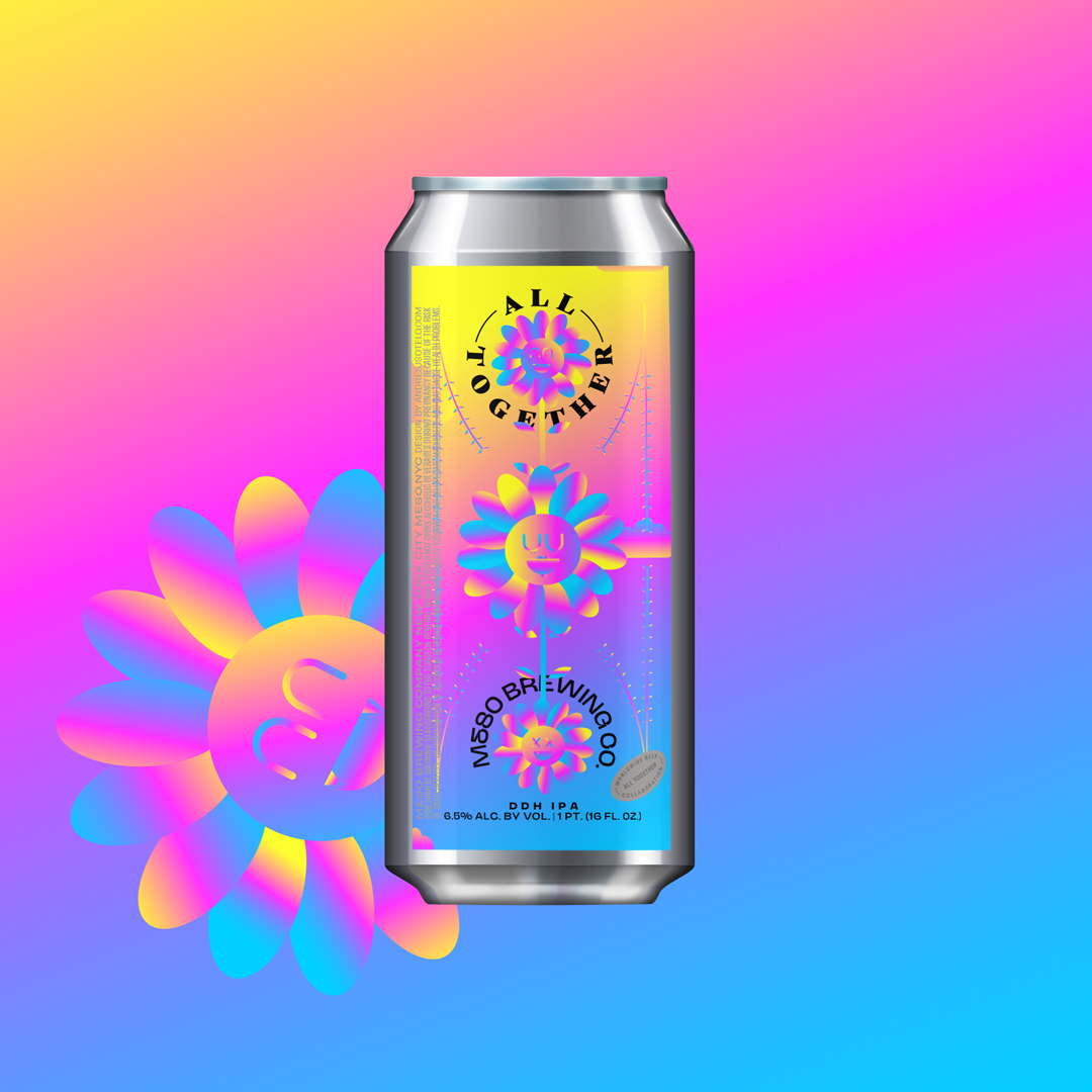
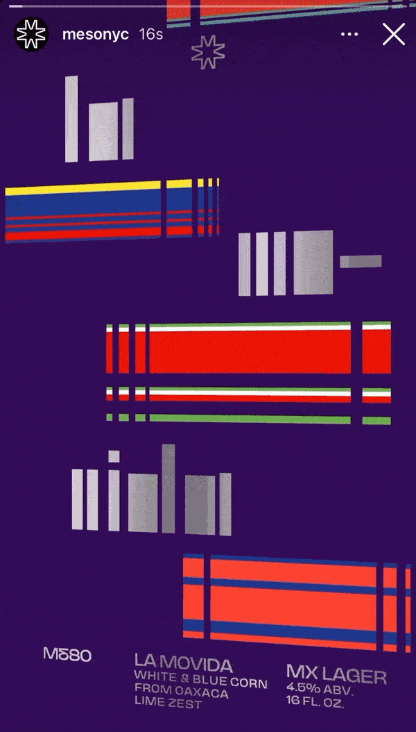
MESO BREWING CO.
ROLE: ART DIRECTOR ︎ DESIGNER
TOOLS: ADOBE ILLUSTRATOR ︎ AFTER EFFECTS ︎ PHOTOSHOP
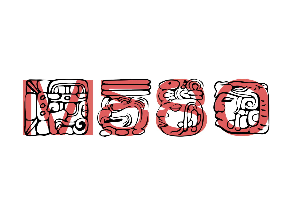
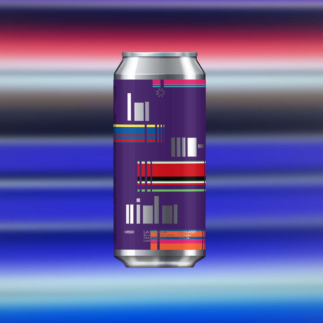
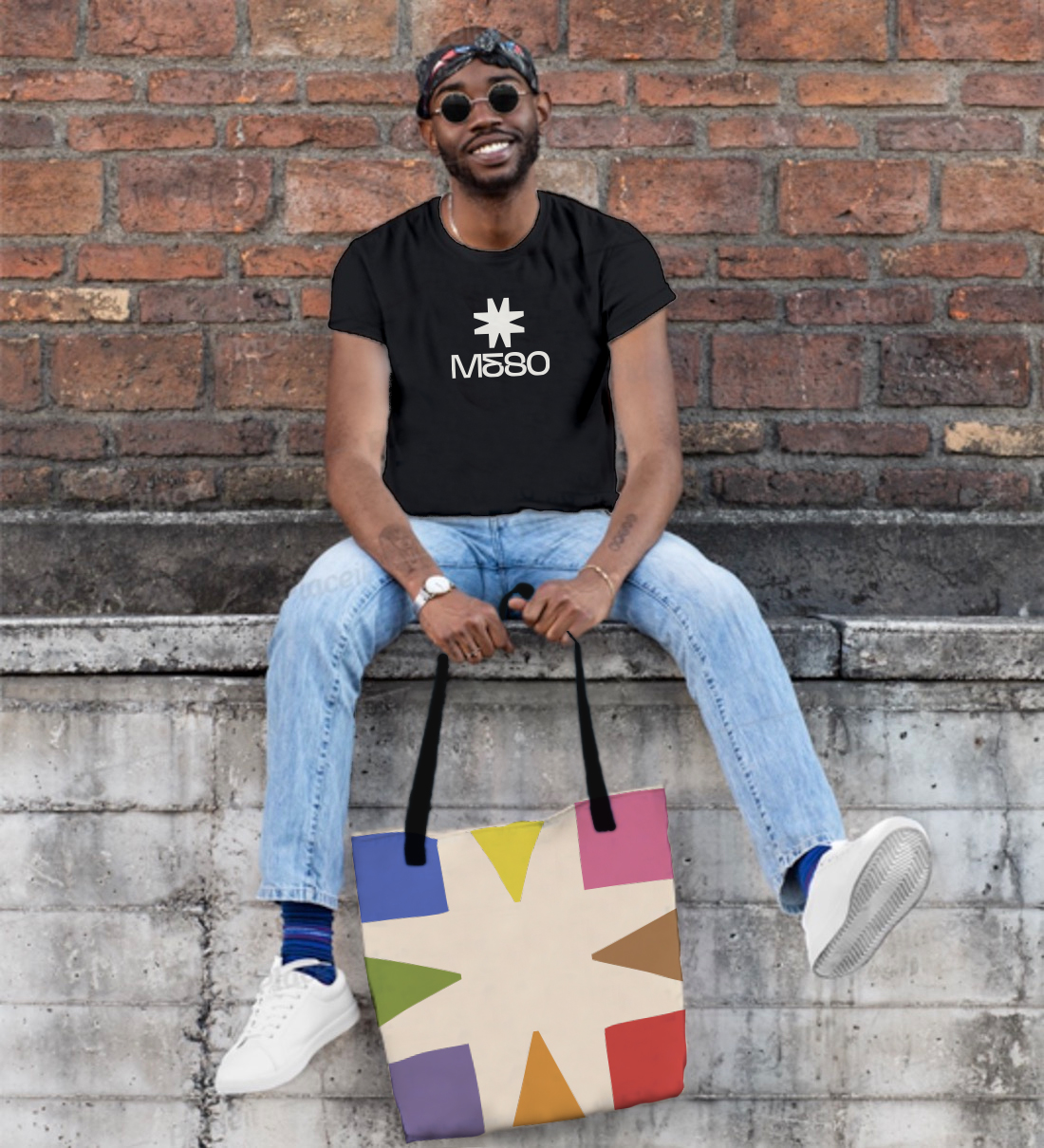
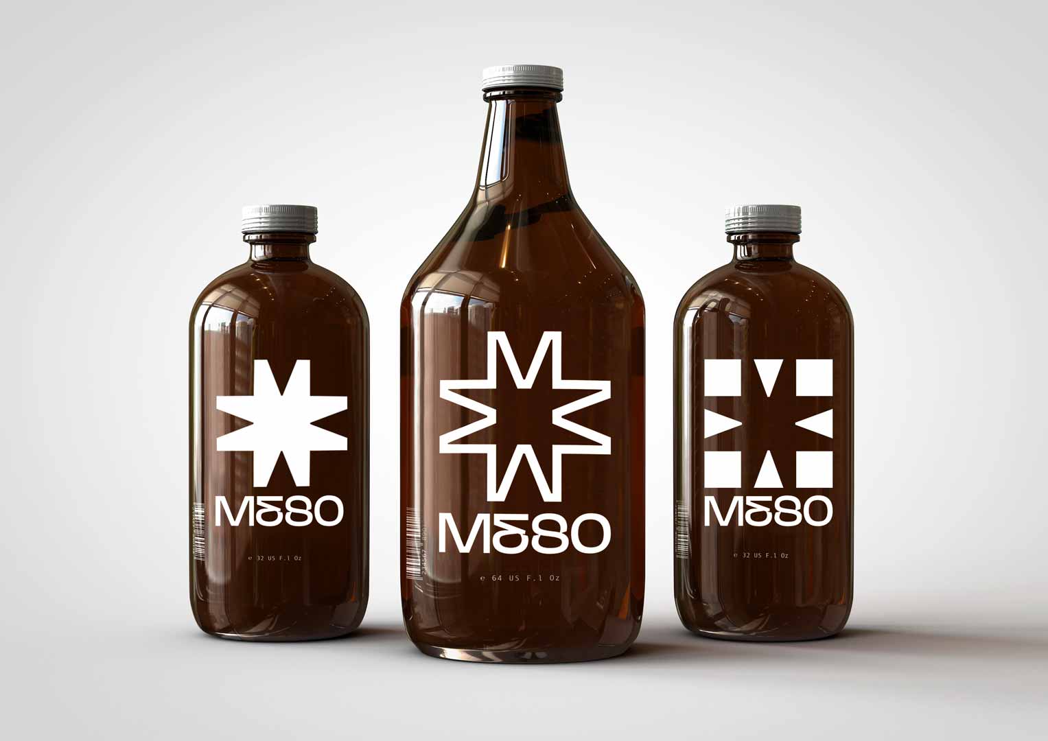
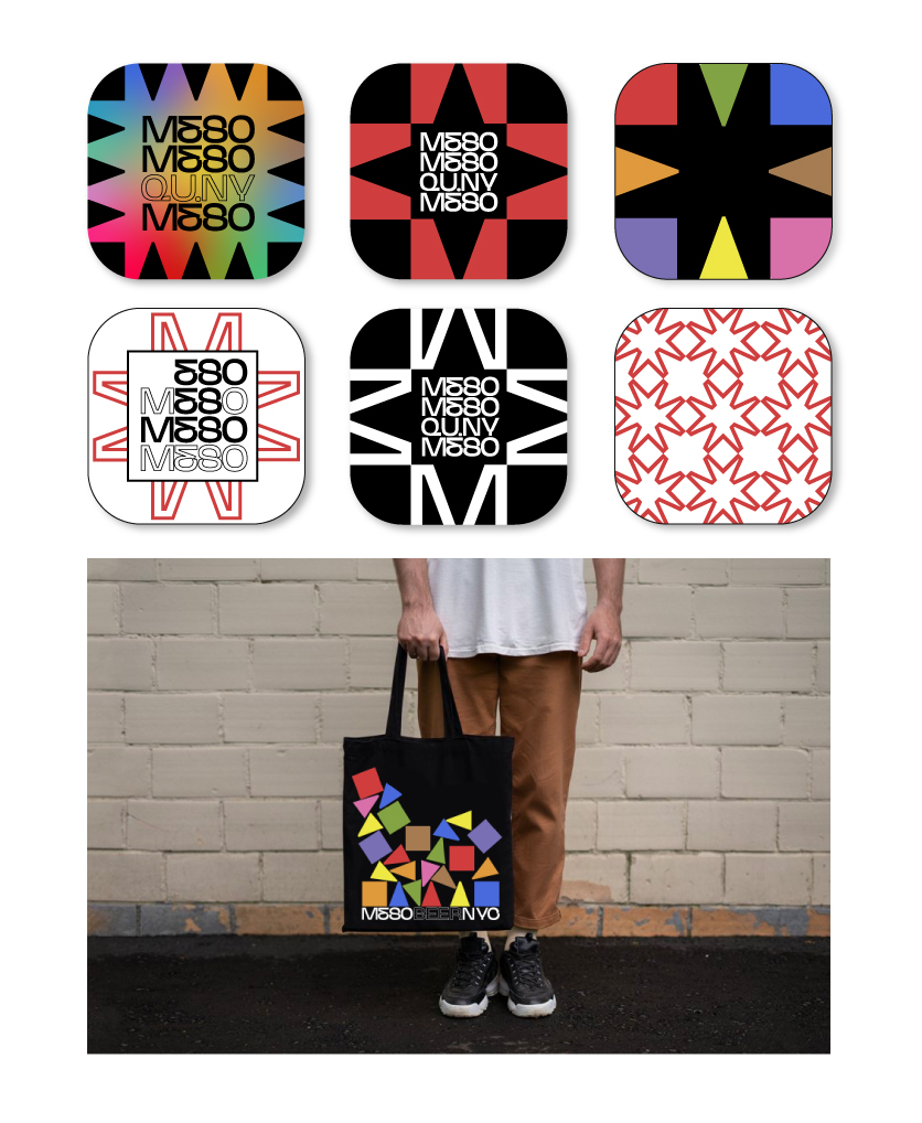
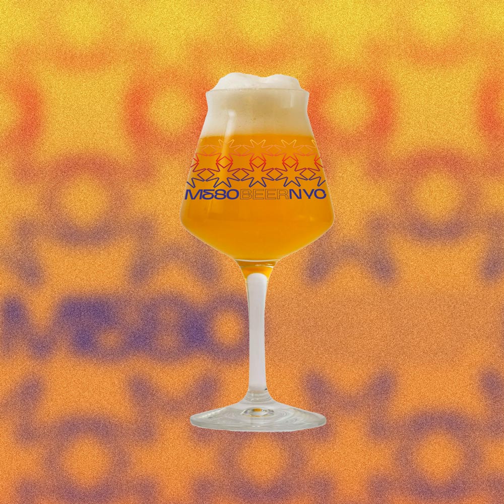
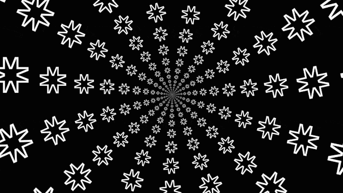
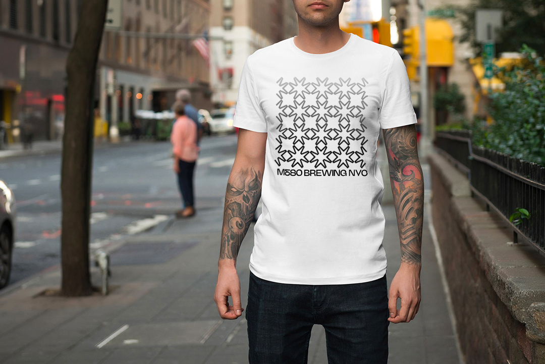
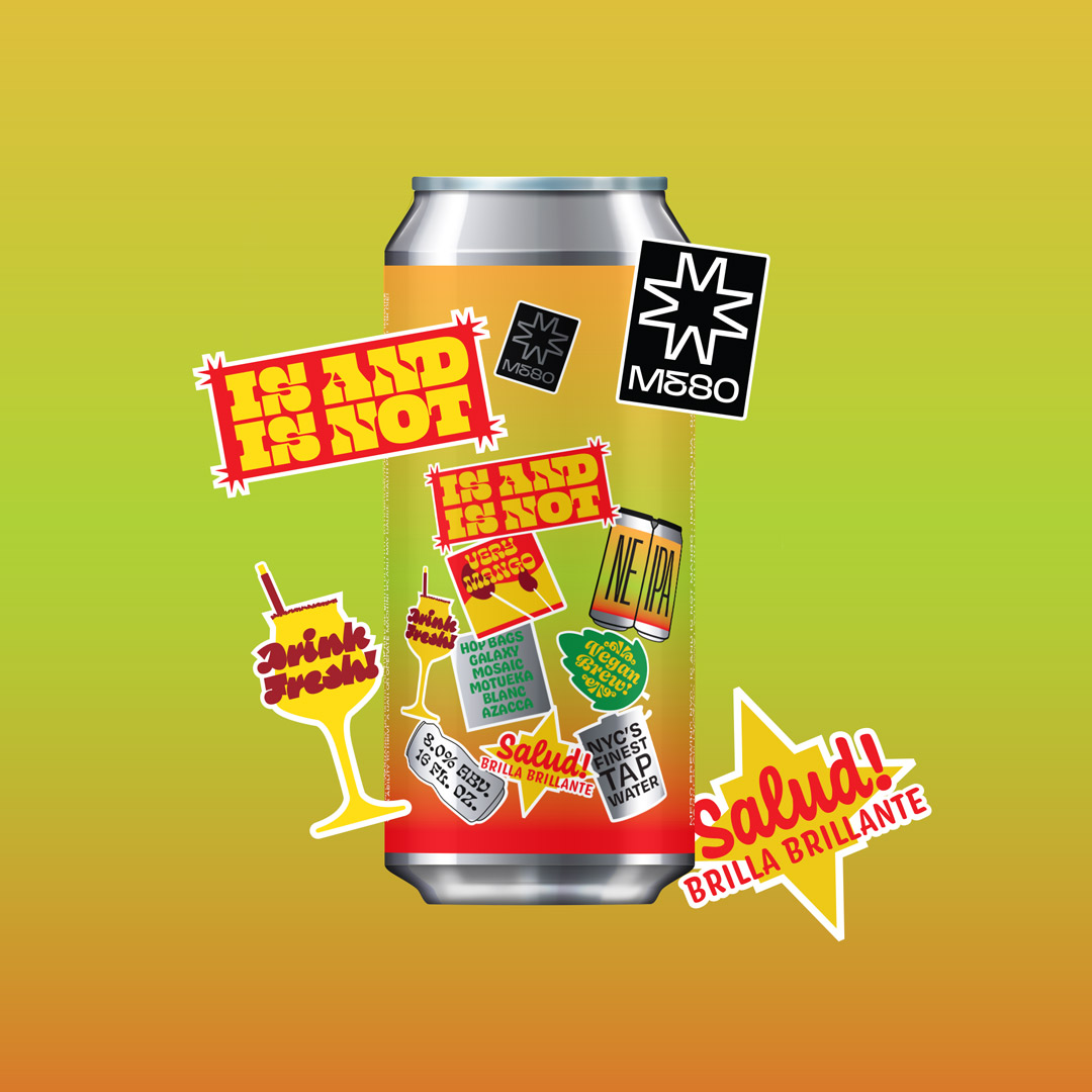
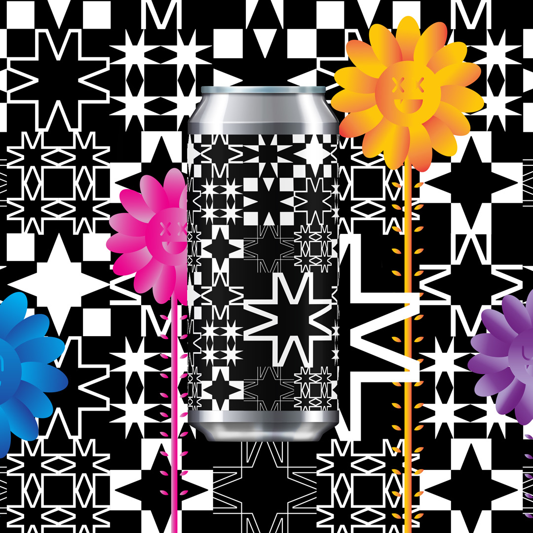
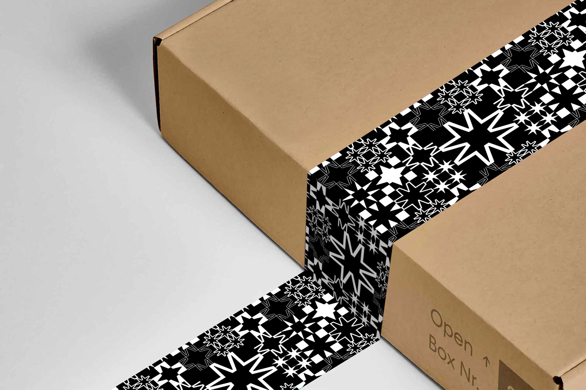
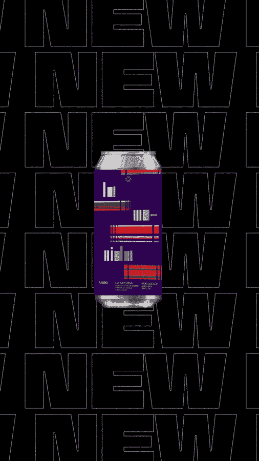
This was a brand identity project for a new NYC nano-brewing company. Meso means to 'combine forms': a driving concept behind the Latinx brewer’s practice and products. The logo mark follows this theme in being constructed of four M’s that together form a star. This shape is a reference to the Native Sun: a cultural symbol that represents praise and celebration. The flexible design system incorporates the relevant tones, textures, and energy of a culturally-driven brand through equally vibrant and distinguishable characteristics–as is essential for a company of its kind seeking to position itself in a lively but saturated marketplace.http://mesobrewing.nyc/